Share the love


Love is in the air. To share my love with all of you, I have created 4 special hand-lettered Valentines, FREE to download. All you have to do is click on the links below, print, trim, fold, and give them to your special someone one next Sunday.

Love

Kiss

XO (colour)

XO (black and white)

Want to make your own Valentines? Join Ligatures this Thursday in Toronto for their "Love Letters" event. RSVP today!


Nifty numeral


I'm tickled pink to share you my contribution to Uppercase Magazine's "Nifty Numeral" project, which is published in Issue 28. Janine asked 10 designers, typographers and lettering artists to submit their favourite number. Here's mine:
F-O-U-R: the only number whose value is the same as the number of letters in its name. Four sides make a square, the basis for our grid system. Conceptually, four connotes strength, stability, and order – a perfect fit. The standard peaked 4 can also be drawn by connecting four points in succession. 1-2-3-4.
Four leaf clovers are lucky; a 4.0 is the finest grade-point average one can attain. Most furniture has four legs; most vehicles have four wheels. You can’t play cards without four suites (hearts, diamonds, clubs, and spades); a ballgame certainly wouldn’t be the same without four bases. We couldn’t explore the “four corners of the world” without the four cardinal directions (North, South, East, and West). We wouldn’t be able to enjoy the four food groups (meat, dairy, grain, and produce) without Mother Nature’s four seasons (Spring, Summer, Fall, and Winter).
Most importantly, our beautiful world of print wouldn’t be the same without our beloved four process colours: cyan, magenta, yellow, and black.
Check out the complete list of stockists and pick up your copy today!

Looking back, moving forward


2015 was a marathonic year, with many hurdles and obstacles, but also great rewards.
As in previous years (2011, 2012, 2013, 2014), here is my annual recap of how my year unfolded.

January was cold and long. I kept myself busy creating the Emoji Alphabet Project.

In February, I completed a chalkboard at The Body Shop. I also started the Emoji Alphabet Project, which got some nice press.

March brought some more nice press for the Emoji Alphabet Project. I also did a special piece of art for the F**k Status Quotes project.

In April, I did a big menu chalkboard for Church Street Espresso.

May brought spring weather and a chalkboard for RedLab Digital. I also had the privilege to
co-instruct Type Camp pointed pen workshop at TDC (Type Director's Club) in New York City. Amazing!

June was a busy month for client work. Ligatures also held our first Type Attack!

In July, I co-taught a special Ligatures brush pen workshop in Calgary, in partnership with GDC (Graphic Designers of Canada) and Uppercase Magazine. My sister also got married, and I turned 33!

August was filled with two back-to-back Ligatures brush pen workshops in Toronto, introducing a fun new layered alphabet in the workshop plan.

September was all about my big 2015 rebrand. More photos here. I also unveiled a special painting, created for the Buddies in Bad Times Art Attack auction.

October was busy to say the least. My Ellen Lupton interview was published in Uppercase Magazine. Also, the Toronto Etiquette Project (and my mugshot) were featured prominently on the masthead of the Toronto Star's GTA section. I was also thrilled to share that my 2011 poster of Macbeth for Shakespeare Toronto / Classical Theatre Project  was published in the new Mirko Ilić / Steven Heller book Presenting Shakespeare: 1,100 Posters from Around the World, published by Princeton Architectural Press.

In November, I unveiled my winter collection 2015, including reveal the new Emoji Map of Canada. I had the privilege of attending RGD DesignThinkers on behalf of Uppercase Magazine. Here are the links to Day 1 & Day 2. November was also a busy month for chalkboards: a massive 25 foot one for Flock restaurant, and three for the new Loaded Pierogi restaurant.

December was all about City of Craft Winter 2015, with some special products created just for the show. The event was a huge success, and I can't wait to apply for next year's show.

This massive year wouldn't have been possible without the support of YOU – family, friend (new and old) and clients (new and old). Thanks to everyone who purchased a print in my shop, donated to my 10K run, liked one of my Instagram photos, attended a Ligatures workshop, or visited my booth at City of Craft. Your generosity inspires me. I am truly blessed to do work I love each day.

May 2016 bring you happiness.

CR

Alphabet a day


Here’s my project for the year: one complete alphabet (A-Z) hand-lettered and posted at the end of every weekday in 2016. If my math is correct, that should be 250 alphabets by December 31. Wish me luck!

Follow my progress on Instagram.

Loaded Pierogi, part 2


A few weeks ago, I wrapped up 3 chalkboards at the second Loaded Pierogi restaurant, located at 1044 Gerrard Street East. Please stop by, grab a delicious gourmet pierogi, a flight of premium vodkas, and check out the new chalkboards. More details and progress shots below.

Thanks again to Adam & Bryan this opportunity. Best of luck!

Check out the chalkboards for the first Loaded Pierogi here.


City of Craft 2015 recap


The masses converged at Toronto's Theatre Centre last Friday, Saturday and Sunday at Toronto's favourite winter market, City of Craft. With over 60 vendors on two floors, it truly was the best place to check out Toronto's finest crafters and get a head start on holiday shopping. Below are some photos of my booth, as well as some custom hand-lettered cards created on the spot.

Thanks to Kalpna, all of the CoC volunteers, and well as the Theatre Centre staff for making this year's event magical and memorable. But above all, I must thank everyone who stopped by my table to say hi, share their love for lettering and purchase some of my work. Your support is the best holiday gift.

Happy Holidays to you and yours!


City of Craft 2015


Come find my booth this weekend at Toronto's favourite winter market, City of Craft.

December 11, 12 & 13, 2014 
Friday 6pm-10pm
Saturday 11am-6pm
Sunday 11am-5pm

The Theatre Centre 
1115 Queen Street West
(one block west of Queen and Dovercourt)

$2 (Kids 12 & Under FREE)


Along with items from my Winter Collection (including my 2015 Holiday Cards & Emoji Map of Canada), I also have 4 fun new products created just in time for this show:

1) Custom greeting cards 
$5 each or free with any purchase over $25


2) Hi! / Bye! greeting cards (letterpress-printed with care by Snap + Tumble)
$6 each or 4 for $20


3) Homo Sweet Homo 2 (original framed painting & limited edition giclee prints available
$60


4) Hand-painted signs (acrylic on wood)
$40

Flock


I recently had the privilege to revamp the HUGE chalkboard at Flock, Toronto's best rotisserie chicken and greens. Here's a peak at the new 5' x 25' board. To get the full effect – and to enjoy a great lunch – stop by their restaurant at 330 Adelaide St. W.

Thanks again to Benjamin for this opportunity!

DesignThinkers 2015, Day 2


2.1) Austin Kleon
Designer, author: austinkleon.com, Austin, TX
"How to Steal Like an Artist"
  • in high school inspired by Green Day Insomniac album art - collage work by Winston Smith
  • as a class assignment, wrote a letter to Winston Smith (in Microsoft's ransom font) - got a handwritten, 12 page reply - changed his life
  • interested in redacted newspapers - "CIA haiku" - blackout poems
  • soon discovered this concept was NOT unique; previously done by:
    • William Burroughs
    • Brion Gysin
    • Tristan Tzara
    • Caleb Whiteford et al.
  • nothing is original; therefore, steal everything!
  • stealing has been used or endorsed by many artists:
    • Pablo Picasso "Art is theft."
    • David Bowie "[I'm] a tasteful thief. The only art I’ll ever study is stuff that I can steal from."
    • Woody Allen
    • Kurt Vonnegut
    • Bob Dylan
    • TS Eliot "Immature poets imitate; mature poets steal."
    • Francis Ford Coppola "Ripoff everyone you meet."
  • imitation is not flattery; transformation is flattery
  • take what you know and share it
  • learn, teach - repeat
  • just keep telling yourself: it's art.


2.2) Manuel Lima
CodeAcademy.com, New York, NY
Author: Visual Complexity: Mapping Patterns of Information, The Book of Trees
"Visualization Metaphors: Unraveling the Big Picture"
  • we are in a data deluge
  • similar transition happened in the Middle Ages
    • overhaul in book production
    • cheaper printing created
    • emphasis on classification and organization
  • beginnings of visual communication - graphics replacing text
  • search for universal language
  • form vs. function - should be no distinction
  • TREES = source of
    • food
    • medicine
    • energy
    • shelter/wood
  • TREES = visual metaphor for
    • virtues/vices
    • consanguinity
    • geneology
    • law
    • knowledge/science
  • trees vs. networks - tree metaphor can no longer handle the complexity of the modern world
  • the 21st century is characterized by organized complexity (Warren Weaver)
  • the brain should be seen as "an orchestra" (not a series of compartments)
  • humans do not conform to rigid structures
  • tree = spider = centralized - can be destabilized by removing source
  • web = starfish = decentralized - any part removed only grows back
  • value of multiple viewpoints (Thirty-Six View of Mount Fuji)
  • networks/"networkism" - new visual trend/meme - seen in art - emerging as a zeitgeist


2.3) Chris Dixon
Design Director, Vanity Fair, New York NY
"Telling Stories with Words and Pictures"
  • job at Adbusters - learned through trial and error, experimentation, flow and pace of a magazine is like a film
  • job at New York Times - learned about quick turnarounds (9/11)
  • job at New York Magazine - learned about making photographic solutions


2.4) Sebastian Padilla
Co-founder, Anagrama, Monterray + Mexico City, MX
"Going Fast to Nowhere"
  • as a child, had ADD, was not passionate about design
  • graphic design was the easiest program to get into
  • was CURIOUS
  • embraces "Mexican happiness", camp, and colour palette ("Mexico invented colour")
  • experimented with "norm-core" for taqueria rebrand
  • success = balancing small clients (interesting) and large (well-paid, good exposure)
  • no harm in admitting "I can't do it on my own"
  • you can do just about anything if you find someone who has/values
    • energy
    • diversity
    • sharing
    • principles
    • skills
    • trust


2.5) Michael Lejeune
Creative Director, Los Angeles Metro
"The Power of Staying Put"
  • "stay put" = let something grow and blossom
  • LA was awarded "worst traffic in the country" 25 years in a row
  • campaigns begin to address this - ie. "what do you see when you're not driving"
  • "Stay put to learn your corps."
    • know your team, your people, your community
    • replace out-of-the-box solutions
    • "design works"
  • "Stay put to change your corps."
    • everything is an opportunity for clarity
    • do what is not expected
  • "Stay put to be where you are."
    • Metro campaign "the agency of MORE"
      • more savings
      • more lanes
      • more jobs
  • "Stay put to see the future."
    • you are not fully committed until you are full committed
  • "Stay put to be valued."
  • "Stay put to rock."


2.6) Paddy Harrington
Founder, Frontier Magazine, Toronto, ON
"A Field Guide to Creative Adventuring"
  • "Make it big and put it in the middle." -Bruce Mau
  • the number of objects an average human can hold in working memory is 7 ± 2 (George Miller)
  • memory power (rational brain) decreased when faces with emotional decisions
  • we live in saturated environments where we are bombarded with information
  • the tree vs. the web - combine the two?
  • Frontier = part magazine, part studio, part ventures
  • power of making something you can hold
  • "Christian Bale-ing it" - turn problems into opportunities
  • "calm makes calm"
  • finds inspiration from NFB archives
  • find what you love – no matter what it is – and embrace it
  • take creative risks - the promise of BETTER
  • balance risk taking and protecting your job
  • most people in the world have no idea what it's like to create something NEW


2.7) Frank Chimero
frankchimero.com, ofanother.com, Brooklyn, NY
"Design is Borderlands"
  • things Frank didn't do:
    • draw the cartoon
    • write the original LinkedIn email
    • write original caption
    • write Atlantic article, etc.
  • things Frank did:
    • heroicly and geniusly copy and paste some text
  • apply this lesson to daily client work - be more humble, modest, turn down bravado
  • drop the baggage, ego
  • design as method of decoration
    • got bored - became "sad clown designer"
    • change frame of reference - do something different
  • design as manner of construction
  • design as process of articulation
    • earned through self-reflection
    • give yourself space to learn, room for doubt, self-ignorance
  • doubt should not be feared but welcomed
  • from doubt comes opportunity
  • find a place for doubt in the designer's toolbox
  • accept "I don't know"
  • "sometimes a rose can grow out of bullsh*t"
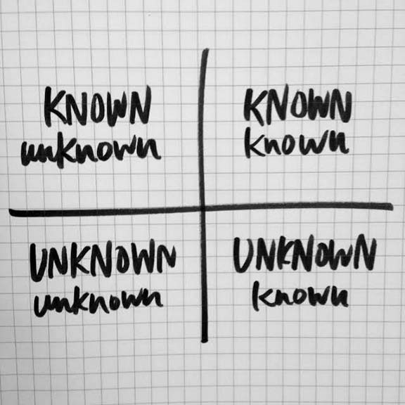
  • how can you find what you don't know...
  • the question is more important than the answer


Day 1 here.

DesignThinkers 2015, Day 1


1.1) James Victore
James Victore Inc., Brooklyn, NY
"Beauty and Magic"
  • always balancing the sacred and the profane
  • "we're living in the future"
  • check the url availability before naming your baby
  • 4 million years ago, apes climbed down trees, and decided to get inside a cave (to evade flying poo)
  • hand became most versatile tool: spoon, toilet paper, backpack, etc.
  • this "spoon" was the same for millions of years
  • spoon became "my spoon" - a totem/talisman - infused with energy, human emotion - CUSTOMIZED
  • tattooes = another form of customization
  • Maslow's hierarchy:
    • CREATIVITY - where beauty and magic begin
    • esteem
    • sex
    • shelter
    • food+water
  • can't have creativity without confidence
  • amazing things happen when you start thinking about the needs of others
  • if you don't have beauty and magic, you can stop your work. You're adding nothing.
  • we need more beauty and magic. We don't need more business.
  • creativity is dangerous - the people in power fear it
  • should be able say "I infused my coolness in _______."
  • "design like you give a damn"
  • "I want all of my work to be love notes." (referring to daily "coffee machine notes" with wife)
  • emoji - a new form of shorthand, language customized
    • a step backwards towards pictographs (history repeating)


1.2) Josh Clark
Big Medium, Brooklyn, NY
Author: Designing for Touch
"Magical UX and the Internet of Things" (slides here)
  • "no pain, no pain"
  • objectives:
    • to make designs physical
    • to change the way we interact with information
    • to move designs from screen to environment
    • to bridge the gap between the digital and the physical
    • take everyday technology and infuse it with imagination, wonder and delight
  • "any sufficiently advanced technology is indistinguishable from magic." -Arthur C. Clarke
  • goal of Alan Kay (1982): make the computer disappear from the environment
  • the smart phone is the first magic wand for everyone - brings computing power to immobile objects
  • problem: people spend an average of 3h16m on their phone - phone has wedged itself between humans; more connected, more disconnected
  • engagement was too easy, and now has become an Achilles heel
  • phones should caption lives, not frame them
  • key: interaction at the point of inspiration
  • screens are the just the medium of the moment - will not always be the case
  • automatic / "automagical" tech makes us weary, worried about the "how", who's in control, big data
  • magical tech is intentional - a human connection between devices; a graceful flow of info
  • real magic is about PEOPLE
  • don't just add data, add insight
  • it's up to us to challenge imagination
  • make technology that
    • bends to our lives
    • strengthens social connections
    • creates joy
    • empowers individuals
  • the magic problem: imagine the world, then make it a reality
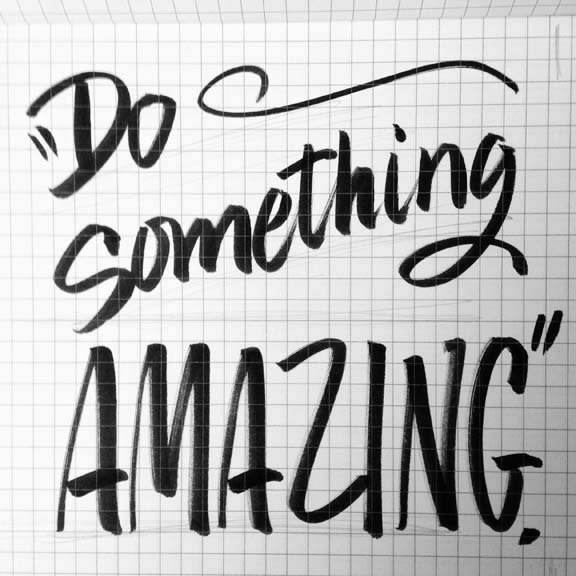
  • DO SOMETHING AMAZING!
demos/mentions:


1.3) Coralie Bickford-Smith
Penguin Books, UK
"Shelf Appeal: How Design is Helping Put Classics in the Hands of Readers
  • as a introvert, books become  best friend - "the most patient of teachers"
  • surrounded by books as a kid
  • in elementary school, won an award for "hard work and politeness"
  • inspired by William Blake, who wrote, illustrated, designed, printed and bound his books
  • attended Reading University - analyzed 200 covers of Robinson Crusoe
  • while working at a magazine, fighting over the placement of a cat graphic, asked herself "is this my life?" - decided to move on
  • took job at Penguin Books - started designing classics
  • challenge: books that get less marketing - need to grab attention on their own
  • "what can I bring to the party?"
  • with cloth bound covers ("new old"), wanted to explore book production, create books that people want to cherish and possess as physical items
  • challenges of foil: 
    • limited palette
    • some foils don't adhere to some cloths, and you don't know until you ry
  • spines are just as important as covers (perhaps more)
  • "I wanted to blow people's minds and create something of beauty."
  • with pattern design and use of icons, it entices those who know the symbology
  • drink coffee, panic, drink coffee, panic...
Editor: "Stop being so historically obsessive."
CBS: "No."
  • The Fox and the Star - new solo book about love, loss and learning to accept change
    • wrote, illustrated, designed
  • "failure is an option" - keep calm and carry on
  • "just draw and draw and draw..."
  • "the blank page is my nemesis"


1.4) Art Chantry
artchantry.com, Seattle, WA
"Art Speaks Posters Yell"

"stop faking design"
grunge poster design: "add boobs"
"grunge" was a marketing term used to sell punk rock to people who hated punk rock
"calling Rocky Horror sexist is like calling water wet"
take everything you know about graphic design and throw it away
teach yourself to work with nothing
universal language of design (line, colour, shape, text) - constantly evolving
graphic design is a powerful language - the power "to change people's minds"
"we're mind blowers"
graphic designers will do it for anyone who pays them (even Ronald Reagan...)
decided "I wasn't going to work for *ssholes"
become involved in community, started doing work that mattered
"want to do cool work? work for cool clients."
"sometimes, the only way to move forward is to take one step back first"
use your hands - engage in the process
drag the client into the work so that it becomes theirs too


1.5) Jean-François Porchez
Typofonderie, Paris
"Adding Value to the Invisibility of Typefaces"
  • typefaces often "invisible" - need to express language
  • make thought tangible
  • "type breathes voice"
  • "Fashion fades. Style is eternal." -Yves Saint Laurent
  • heritage - the importance of knowing what's come before
  • educate clients about type design
Projects shared:
  • Parisine
  • Geneo
  • Anisette
  • Retiro
  • Sephora Europe
  • Nespresso
  • Yves Saint Laurent
  • Galeries Lafayette


1.6) Annie Atkins
Graphic design for films, annieatkins.com
"The Secrets of Designing Worlds for Film"
  • designs any and all graphics which appear on camera - sets and props - notes, signage, patterns, newspapers, etc.
  • "don't like" doesn't mean "not good"
  • make it by hand if it was originally made by hand
  • temporal nature of props - several identical copies needed, sometime in "before" and "after"
  • take responsibility for details - imitate tactile world
  • small details seem unnecessary, but make all the difference for actors - create the experience
  • Fascist business cards - "Hitler was the fanciest Fascist."
Projects shared:
  • The Tudors
  • Box Trolls
  • Grand Budapest Hotel


1.7) Karim Rashid
Karim Design, New York, NY
"The Business of Beauty"
  • design is not well-defined
  • graphic design is the bridge between industry and human life
  • world started as a grid because it was easier to cut straight lines
  • we are having more informed experiences than ever before
  • old vs. new, analog vs. binary, material vs. immaterial
  • "bioneers of the digitial age"
  • trying to bring analog back into digital world
  • "I want to make a better world."
  • design is a creative act, a political act
  • obsessed with ovals - "corner represents an obstacle"
  • straight lines to not exist in nature – anywhere
  • nature is cruel, dangerous, dystopic (no order) - we want order
  • make world better, more beautiful, or don't bother.
  • we are hyperaware of our mortality in a digital age
  • "kitsch" is a cheap replica of the authentic; meaningless adornment
  • problem with humanity is the fear of everything - HAVE NO FEAR
  • as humans, we are original (fingerprints, iris) so we want to create something original
  • we are all born with the gene to create; therefore we are all creative
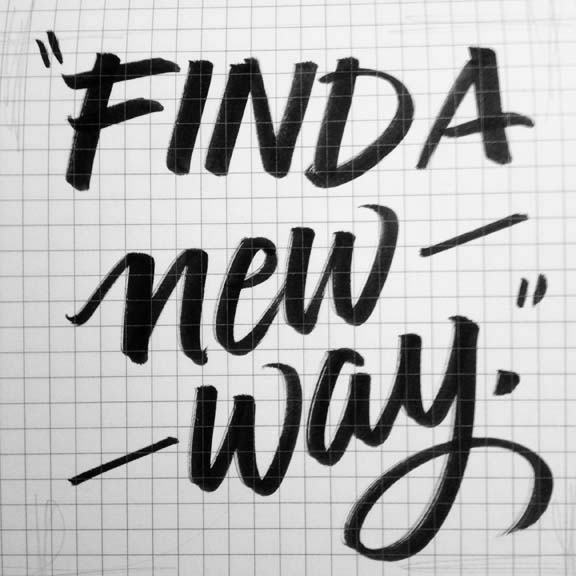
  • find a new way
  • the power to change the world is reliant on YOU
  • the most pivotal moments in history where changed by single people
  • the future is shaped by us, which is the purest form of democracy
  • digital age is actually humanizing us
  • what is luxury in the digital world? freedom.
  • make your hobby your job
  • eradicate banalities
  • don't die saying "I wasted my time"
  • time is limited - don't waste it, use it to shape a better world
  • act like you're not from this planet
  • any dreams can become reality


Day 2 here.