Showing posts with label published in uppercase. Show all posts

Looking back, moving forward


As in previous years (201120122013201420152016201720182019, 2020), here is my annual recap of how my year unfolded.

In January, my article for UPPERCASE Magazine hit the stands. 

February was mostly dedicated to paint explorations (The results come later in the year...)

In March, I completed a couple of fun sign and mural projects for a boutique toy store.

In April, I released a collection of paintings called "New & Improved".

May was more studio painting time, which lead to the release of my "Painted with Pride" collection in June.

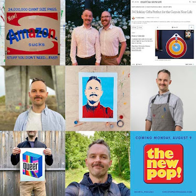
In July, I completed some custom lettering for a theatre game show called "Whose Land is it Anyway". I also completed some custom sign painting for one of my favourite local shops, Secret Planet. As well, I did some custom lettering for the cover of Reader's Digest (in English and French!) July was also my birthday month and I painted a self-portrait to mark the year.

In August, after weeks of preparation, I launched a series of 21 paintings called The New Pop. I also painted a couple of interior murals for a new pediatric clinic.

In September, I jumped on a plane to NYC for a top secret project (more details in December...)

In October, I designed a new album for local musician Jeremy Voltz. I also snuck away to visit my family - and the Rocky mountains.

In November, I refreshed my "Not Amazing" campaign to encourage people to shop local. I was also thrilled to share that my Rotary Calendar was now available at the Art Institute of Chicago gift shop.

The biggest news of the year came in December. My new online course, Sign Creation with Hand-Painted Lettering, was launched on Domestika. It is so exciting that I'll be able to share my passion for sign painting with students from around the world. And to cap of the year, I received a most generous mention of my Rotary Calendar from Martha Stewart in her holiday guide54 Holiday Gifts Perfect for the Guys in Your Life.

2021 was another topsy turvy year. I am endlessly grateful to be able to do work that I love. This also marks 10 full years of freelance life (more to come on that in the new year...)

Have a safe and happy holiday!

The Encyclopedia of Inspiration: Ephemera


I’m honoured to be part of UPPERCASE Magazine's most recent literary creation: The Encyclopedia of Inspiration: Ephemera. This stunning 448-page softcover (available in four different covers!) features gorgeous and inspiring collections of vintage ephemera along with profiles of 30 creatives who make art and business through their collections. Available for retail and wholesale purchase on the UPPERCASE website:
https://shop.uppercasemagazine.com/collections/books/products/ephemera


Many thanks for Janine for including me in this special project, and for her amazing ability of connecting creatives around the world through the magic of print.

Check out some of my featured ephemera at @chrisfoundthis.

The ABCs of Typography book


A is for Ascender, B is for Bowl, C is for Cap height ... Want to learn some more?

This 6" x 6" delightful volume, published by The Harvest Commission, takes us through a abecedary of typography. Kids and adults alike are sure to learn something new and grow their appreciation for the art of letterforms and the arrangement of type. Based on the popular abecedary originally published in Issue 35 of UPPERCASE Magazine (Fall 2017), and the subsequent abecedary print.

Available in my shop, as well as Amazon.

https://www.etsy.com/ca/listing/650936054/the-abcs-of-typography-book

Typography in technicolour


Be sure to check out Issue 37 of UPPERCASE Magazine, where you will find my recent article about the history of chromatic type. Thanks Janine for this great opportunity!

Issue 31


I'm thrilled to unveil not one but TWO exciting new projects. I had the pleasure I writing two stories in Issue 31 of UPPERCASE Magazine, which both centred around the concept dear to my heart: design for the performing arts.

The first was an interview with Dublin-based film graphic designer, Annie Atkins, who is most renowned for her meticulous design work on Wes Anderson's film, Grand Budapest Hotel.

My other story focussed on the talents of Michael Gianfrancesco, who designs sets and costumes for the theatre at stages across North America. He is one of Canada's most sought-after designers, and has worked at The Stratford Festival for 13 seasons.

Many thanks to Annie & Michael for generously donating their time, and to Janine for these great opportunities to showcase talent of this calibre.

Check out my previous UPPERCASE contributions here.

Coralie Bickford-Smith


Last November, I had the pleasure of interviewing book designer Coralie Bickford-Smith at the RGD Design Thinkers conference in Toronto. Ms. Bickford-Smith was a pleasure to chat with, and had lots of great things to say about design, problem solving, and the changes in the publishing industry.

You can read the full interview in issue 29 of Uppercase Magazine. Thank you to Ms. Bickford-Smith for her time and to Janine for this great opportunity.

p.s. Janine was kind enough to list me as a Featured Contributor in the current issue. Thanks, Janine!

Nifty numeral


I'm tickled pink to share you my contribution to Uppercase Magazine's "Nifty Numeral" project, which is published in Issue 28. Janine asked 10 designers, typographers and lettering artists to submit their favourite number. Here's mine:
F-O-U-R: the only number whose value is the same as the number of letters in its name. Four sides make a square, the basis for our grid system. Conceptually, four connotes strength, stability, and order – a perfect fit. The standard peaked 4 can also be drawn by connecting four points in succession. 1-2-3-4.
Four leaf clovers are lucky; a 4.0 is the finest grade-point average one can attain. Most furniture has four legs; most vehicles have four wheels. You can’t play cards without four suites (hearts, diamonds, clubs, and spades); a ballgame certainly wouldn’t be the same without four bases. We couldn’t explore the “four corners of the world” without the four cardinal directions (North, South, East, and West). We wouldn’t be able to enjoy the four food groups (meat, dairy, grain, and produce) without Mother Nature’s four seasons (Spring, Summer, Fall, and Winter).
Most importantly, our beautiful world of print wouldn’t be the same without our beloved four process colours: cyan, magenta, yellow, and black.
Check out the complete list of stockists and pick up your copy today!

Ellen Lupton


Last November, I had the pleasure of interviewing Dr. Ellen Lupton at the RGD Design Thinkers conference in Toronto. Dr. Lupton was incredibly gracious and offered some great insights on graphic design, education, and the changing industry.

You can read the full interview in issue 27 of Uppercase Magazine. Thank you to Dr. Lupton for her time and to Janine for this great opportunity.

Also: check out my interview of Honest Ed's sign painter Wayne Reuben in issue 23 of Uppercase Magazine.

Signs of the Times


I am thrilled to share a new project that has been months in the making.

Back in January, I submitted an open pitch Uppercase Magazine. The idea: to profile the signs and sign painters of Toronto's beloved department store, Honest Ed's, which was recently slated to close its doors. I contacted Mr. Wayne Reuben, one of the two remaining sign painters, and was able to set up an interview, with the help of Honest Ed's general manager, Mr. Russell Lazar.

I was blessed to be paired with photographer Becca Gilgan, who joined me on the day of the interview to capture Mr. Reuben's work & studio, as well as the department store itself. Despite the challenges presented by the space and lighting conditions (curse you, fluorescent bulbs!), Becca exquisitely captured the beauty and character of Mr. Reuben's environment.

It was an honour to spend the morning with Mr. Reuben, a skilled craftsman who has been keeping the sign painting tradition alive for 40+ years. He spoke candidly about his career at Simpson's & Honest Ed's, the good old days with Ed Mirvish, and the industry's transition from analog painting to the digital era of signmaking. His tone was warm and paternal, like that of a grandfather, making our time together most memorable. Thank you, Wayne.


I would like to thank Janine Vangool for this incredible opportunity to honour Mr. Reuben's legacy, and for her beautiful layouts in the issue. Much thanks to Beeca Gilgan for her masterful photos – your talent is awe-inspiring. Thank you to Jess & Leslie for your help in acquiring signs for the spreads. And thanks to everyone else who helped with proof reading and making the article perfect.

I encourage you to pick up this beautiful calligraphy & lettering issue of Uppercase at your local bookstore – please check out the list of stockists on the Uppercase website here. As further incentive, Uppercase is currently offering $15 off subscriptions until October 31. Simply use offer code letterlove when placing your order. You can place your order or become a subscriber here.

(Photo credits: Janine Vangool / Uppercase Magazine)